Araña interactiva para el blog, que se mueve


Esto no es como aquella araña de Halloween que vimos hace tiempo que no era mas que una imagen GIF animada. Esto es parte de la modernidad web, hecho en canvas, y se trata de una araña que se mueve por si sola dentro de su telaraña, y que podemos arrastrar con el cursor, tanto a la araña como a la telaraña y sus puntos de apoyo. El demo aquí mismo.


Este gracioso experimento es de Sub Protocol, y nos servirá como parte de las decoraciones de Halloween en el blog. Este arácnido requiere de dos scripts para su funcionamiento, ambos los he alojado para que no tengan que preocuparse por buscar un hosting, pero, he notado que el desempeño de estas canvas son más eficientes si alojamos los scripts directo en la plantilla, o al menos a mí esa percepción me ha dado.

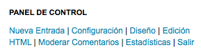
Para colocar esta araña interactiva en tu blog ingresa en Diseño | Añadir un gadget | HTML/Javascript y ahí pega este código:

<script src='https://googledrive.com/host/0B1sh31bxfVkGYUVMRXFyeUROQ2s' type='text/javascript'></script>
<canvas id='scratch' style='width: 500px; height: 350px; margin-left: -80px; margin-top: -30px;'></canvas>
<script src='https://googledrive.com/host/0B1sh31bxfVkGbTVWTlhlangwdWM' type='text/javascript'></script>

Si quieres también puedes hacer que sea "flotante", es decir, que permanezca estática sin importar si subimos o bajamos el scroll de la página. Para conseguirlo sólo añade lo siguiente debajo del código anterior.

<style>
#scratch {
position: fixed;
top: 0px;
left: 0px;
}
</style>

Con top indicamos que se muestre arriba, si la quieres abajo cámbialo por bottom. Con left hacemos que se acomode a la izquierda, si lo quieres a la derecha cámbialo por right. Toma en cuenta que al hacerla flotante podría obstruir algún elemento de tu blog que quede por debajo de ella.

Con esta araña, esta próxima noche de brujas tú y tus lectores podrán entretenerse un rato en el blog jugando con ella, eso sí, no la saques de su red o la pobre morirá :(

Firma Post


Lluvia en el blog

Este script de Giffy se pone y se quita en un solo paso. Adicionalmente le he añadido un sonido suave de lluvia, pero este es opcional.

Para poner esta lluvia en el blog, entra en la Edición HTML de tu plantilla, y antes de </body> pega este código:

<!-- Lluvia en el blog -->
<div style="display:none;">
<script type="text/javascript" src="http://blogparts.giffy.me/0117/parts.js"></script><p style="text-align: center;margin:0;padding:0;">
<a href="http://giffy.me/baby/"><img style="border:0;" src="http://blogparts.giffy.me/0117/parts.gif" alt="降水確率100%ブログパーツ;" /></a></p>
<p style="text-align:center;font-size:12px;margin:10px 0 0 0;padding:0;">
[PR] <a href="http://typing.twi1.me/" rel="nofollow">楽しくタイピング練習!</a></p>
</div>
<iframe allowtransparency='true' frameborder='0' marginheight='0' marginwidth='0' scrolling='no' src='http://audio-play.blogspot.com/p/lluvia.html' style='height:0; width:0;'></iframe>
<!-- Fin lluvia en el blog -->

Lo que está en color naranja es el iframe que contiene el sonido de la lluvia, si no quieres el sonido elimina toda esa parte.
En lo que concierne al script, no tiene opciones de configuración pero creo que tampoco hace falta ya que cumple con su cometido.
Firma Post


Nieve en el blog - otro efecto

 
pega el contenido antes de </head>
<script language='javascript' type='text/javascript'>
//<![CDATA[
// Nevando en la pagina por Eloi Gallés Villaplana
// Adaptado a navegadores DOM por Iván Nieto - junio 2007

var numero = 16
var velocidad = 4
var imagennieve = "https://blogger.googleusercontent.com/img/b/R29vZ2xl/AVvXsEiwLup-ZFq4aaJvvQ6S7oqvUeU-DI14jlq6vxPnzLIuWuDuNsho2Fjrg2r33FeeozkmjiH0eEP_Ynkc8r4QvSICnaqqTFPEBmfuegk-RrF_JTudvqxCa9iP6ZZGDQzfprNZKbpEHNnj-Yru/"

var ns4arriba = (document.layers) ? 1 : 0
var ie4arriba = (document.all) ? 1 : 0
var dombrowser = (document.getElementById) ? 1 : 0

var dx, xp, yp
var am, stx, sty
var i, doc_ancho = 1024, doc_alto = 768

function nieva() {

establece_dimensiones()

dx = new Array()
xp = new Array()
yp = new Array()
am = new Array()
stx = new Array()
sty = new Array();
   
for (i = 0; i < numero; ++ i) {
dx[i] = 0
xp[i] = Math.random()*(doc_ancho-50)
yp[i] = Math.random()*doc_alto
am[i] = Math.random()*20
stx[i] = 0.02 + Math.random()/10
sty[i] = 0.7 + Math.random()
if (document.layers) {
      if (i == 0) {
document.write("<layer name=\"dot"+ i +"\" left=\"15\" ")
document.write("top=\"15\" visibility=\"show\"><img src=\"")
document.write(imagennieve + "\" border=\"0\"></layer>")
      } else {
      document.write("<layer name=\"dot"+ i +"\" left=\"15\" ")
      document.write("top=\"15\" visibility=\"show\"><img src=\"")
      document.write(imagennieve + "\" border=\"0\"></layer>")
      }
      } else if (document.all || document.getElementById) {
      if (i == 0) {
      document.write("<div id=\"dot"+ i +"\" style=\"POSITION: ")
      document.write("absolute; Z-INDEX: "+ i +"; VISIBILITY: ")
      document.write("visible; TOP: 15px; LEFT: 15px;\"><img src=\"")
      document.write(imagennieve + "\" border=\"0\"></div>")
      } else {
      document.write("<div id=\"dot"+ i +"\" style=\"POSITION: ")
      document.write("absolute; Z-INDEX: "+ i +"; VISIBILITY: ")
      document.write("visible; TOP: 15px; LEFT: 15px;\"><img src=\"")
      document.write(imagennieve + "\" border=\"0\"></div>")
      }
      }
     }
   
nieve()
}

function nieve() {
for (i = 0; i < numero; ++ i) {
yp[i] += sty[i];
if (yp[i] > doc_alto) {
xp[i] = Math.random()*(doc_ancho-am[i]-30)
yp[i] = 0
stx[i] = 0.02 + Math.random()/10
sty[i] = 0.7 + Math.random()
establece_dimensiones()
}

dx[i] += stx[i];


if ( document.all ) {
var copo = eval("dot" + i )
copo.style.posLeft = xp[i] + am[i]*Math.sin(dx[i])
copo.style.posTop = yp[i]
}

else if ( document.layers ) {
var copo = eval("document.dot" + i)
copo.left = xp[i] + am[i]*Math.sin(dx[i])
copo.top = yp[i]
}

else if ( document.getElementById ) {
var copo = document.getElementById( "dot" + i)
copo.style.left = xp[i] + am[i]*Math.sin(dx[i]) + 'px'
copo.style.top = yp[i] + 'px'
}
}

setTimeout("nieve()", velocidad)
}
function establece_dimensiones() {
if (self.innerHeight) {
doc_ancho = self.innerWidth
doc_alto = self.innerHeight - 25
} else if (document.documentElement && document.documentElement.clientHeight) {
doc_ancho = document.documentElement.clientWidth
doc_alto = document.documentElement.clientHeight - 25

} else if (document.body) {
doc_ancho = document.body.clientWidth
doc_alto = document.body.clientHeight - 25
}
}
//]]>
</script>
Luego antes de </body> pega esto:
<script language='javascript' type='text/javascript'>
nieva()
</script>

Al inicio del primer código que pegaste verás que dice var numero = 16 ahí puedes modificar el número de copos que quieres que aparezcan y en var velocidad = 4 la velocidad con la que caen.
Firma Post


Nieve en el blog que se acumula al final de la página

La temporada navideña ya es oficial, y al menos los que estamos en el hemisferio norte relacionamos la nieve con la Navidad, así que es hora de abrigarnos porque haremos que caiga nieve en el blog.

En esta ocasión usaremos un script de Schillmania que hará que caigan unos finos copos de nieve en el blog y que se irán acumulando al final de la página. Además, la tormenta de nieve se mueve en dirección contraria al cursor, por lo que si movemos el cursor a la derecha entonces la nieve caerá desde la izquierda y viceversa.

Puedes ver un ejemplo en este blog de pruebas.

Para no complicarnos descargando y subiendo archivos, pegaremos el script directo en un gadget, así podrás quitar la nieve del blog cuando quieras con sólo eliminar el gadget.
Si usas la interfaz antigua entra en Diseño | Elementos de la página | Añadir un gadget | HTML/Javascript.
Si usas la nueva interfaz entra en Diseño | Añadir un gadget | HTML/Javascript.
Ahí dentro del gadget pega el siguiente código:
<script type="text/javascript">
//<![CDATA[
// Nieve en el blog
/** @license
DHTML Snowstorm! JavaScript-based Snow for web pages
--------------------------------------------------------
Version 1.42.20111120 (Previous rev: 1.41.20101113)
Copyright (c) 2007, Scott Schiller. All rights reserved.
Code provided under the BSD License:
http://schillmania.com/projects/snowstorm/license.txt
*/
var snowStorm=function(e,d){function g(a,d){isNaN(d)&&(d=0);return Math.random()*a+d}function o(){e.setTimeout(function(){a.start(true)},20);a.events.remove(i?d:e,"mousemove",o)}function r(){if(!a.excludeMobile||!s)a.freezeOnBlur?a.events.add(i?d:e,"mousemove",o):o();a.events.remove(e,"load",r)}this.flakesMax=128;this.flakesMaxActive=64;this.animationInterval=40;this.excludeMobile=true;this.flakeBottom=null;this.followMouse=true;this.snowColor="#ffffff";this.snowCharacter="&bull;";this.snowStick=true;
this.targetElement=null;this.useMeltEffect=true;this.usePositionFixed=this.useTwinkleEffect=false;this.freezeOnBlur=true;this.flakeRightOffset=this.flakeLeftOffset=0;this.flakeHeight=this.flakeWidth=8;this.vMaxX=5;this.vMaxY=4;this.zIndex=0;var a=this,y=this,i=navigator.userAgent.match(/msie/i),z=navigator.userAgent.match(/msie 6/i),A=navigator.appVersion.match(/windows 98/i),s=navigator.userAgent.match(/mobile/i),B=i&&d.compatMode==="BackCompat",t=s||B||z,h=null,k=null,j=null,m=null,u=null,v=null,
p=1,n=false,q;a:{try{d.createElement("div").style.opacity="0.5"}catch(C){q=false;break a}q=true}var w=false,x=d.createDocumentFragment();this.timers=[];this.flakes=[];this.active=this.disabled=false;this.meltFrameCount=20;this.meltFrames=[];this.events=function(){function a(b){var b=f.call(b),c=b.length;l?(b[1]="on"+b[1],c>3&&b.pop()):c===3&&b.push(false);return b}function d(a,c){var e=a.shift(),f=[b[c]];if(l)e[f](a[0],a[1]);else e[f].apply(e,a)}var l=!e.addEventListener&&e.attachEvent,f=Array.prototype.slice,
b={add:l?"attachEvent":"addEventListener",remove:l?"detachEvent":"removeEventListener"};return{add:function(){d(a(arguments),"add")},remove:function(){d(a(arguments),"remove")}}}();this.randomizeWind=function(){var c;c=g(a.vMaxX,0.2);u=parseInt(g(2),10)===1?c*-1:c;v=g(a.vMaxY,0.2);if(this.flakes)for(c=0;c<this.flakes.length;c++)this.flakes[c].active&&this.flakes[c].setVelocities()};this.scrollHandler=function(){var c;m=a.flakeBottom?0:parseInt(e.scrollY||d.documentElement.scrollTop||d.body.scrollTop,
10);isNaN(m)&&(m=0);if(!n&&!a.flakeBottom&&a.flakes)for(c=a.flakes.length;c--;)a.flakes[c].active===0&&a.flakes[c].stick()};this.resizeHandler=function(){e.innerWidth||e.innerHeight?(h=e.innerWidth-(!i?16:16)-a.flakeRightOffset,j=a.flakeBottom?a.flakeBottom:e.innerHeight):(h=(d.documentElement.clientWidth||d.body.clientWidth||d.body.scrollWidth)-(!i?8:0)-a.flakeRightOffset,j=a.flakeBottom?a.flakeBottom:d.documentElement.clientHeight||d.body.clientHeight||d.body.scrollHeight);k=parseInt(h/2,10)};this.resizeHandlerAlt=
function(){h=a.targetElement.offsetLeft+a.targetElement.offsetWidth-a.flakeRightOffset;j=a.flakeBottom?a.flakeBottom:a.targetElement.offsetTop+a.targetElement.offsetHeight;k=parseInt(h/2,10)};this.freeze=function(){var c;if(a.disabled)return false;else a.disabled=1;for(c=a.timers.length;c--;)clearInterval(a.timers[c])};this.resume=function(){if(a.disabled)a.disabled=0;else return false;a.timerInit()};this.toggleSnow=function(){a.flakes.length?(a.active=!a.active,a.active?(a.show(),a.resume()):(a.stop(),
a.freeze())):a.start()};this.stop=function(){var c;this.freeze();for(c=this.flakes.length;c--;)this.flakes[c].o.style.display="none";a.events.remove(e,"scroll",a.scrollHandler);a.events.remove(e,"resize",a.resizeHandler);a.freezeOnBlur&&(i?(a.events.remove(d,"focusout",a.freeze),a.events.remove(d,"focusin",a.resume)):(a.events.remove(e,"blur",a.freeze),a.events.remove(e,"focus",a.resume)))};this.show=function(){var a;for(a=this.flakes.length;a--;)this.flakes[a].o.style.display="block"};this.SnowFlake=
function(a,e,l,f){var b=this;this.type=e;this.x=l||parseInt(g(h-20),10);this.y=!isNaN(f)?f:-g(j)-12;this.vY=this.vX=null;this.vAmpTypes=[1,1.2,1.4,1.6,1.8];this.vAmp=this.vAmpTypes[this.type];this.melting=false;this.meltFrameCount=a.meltFrameCount;this.meltFrames=a.meltFrames;this.twinkleFrame=this.meltFrame=0;this.active=1;this.fontSize=10+this.type/5*10;this.o=d.createElement("div");this.o.innerHTML=a.snowCharacter;this.o.style.color=a.snowColor;this.o.style.position=n?"fixed":"absolute";this.o.style.width=
a.flakeWidth+"px";this.o.style.height=a.flakeHeight+"px";this.o.style.fontFamily="arial,verdana";this.o.style.overflow="hidden";this.o.style.fontWeight="normal";this.o.style.zIndex=a.zIndex;x.appendChild(this.o);this.refresh=function(){if(isNaN(b.x)||isNaN(b.y))return false;b.o.style.left=b.x+"px";b.o.style.top=b.y+"px"};this.stick=function(){t||a.targetElement!==d.documentElement&&a.targetElement!==d.body?b.o.style.top=j+m-a.flakeHeight+"px":a.flakeBottom?b.o.style.top=a.flakeBottom+"px":(b.o.style.display=
"none",b.o.style.top="auto",b.o.style.bottom="0px",b.o.style.position="fixed",b.o.style.display="block")};this.vCheck=function(){if(b.vX>=0&&b.vX<0.2)b.vX=0.2;else if(b.vX<0&&b.vX>-0.2)b.vX=-0.2;if(b.vY>=0&&b.vY<0.2)b.vY=0.2};this.move=function(){var d=b.vX*p;b.x+=d;b.y+=b.vY*b.vAmp;if(b.x>=h||h-b.x<a.flakeWidth)b.x=0;else if(d<0&&b.x-a.flakeLeftOffset<-a.flakeWidth)b.x=h-a.flakeWidth-1;b.refresh();if(j+m-b.y<a.flakeHeight)b.active=0,a.snowStick?b.stick():b.recycle();else{if(a.useMeltEffect&&b.active&&
b.type<3&&!b.melting&&Math.random()>0.998)b.melting=true,b.melt();if(a.useTwinkleEffect)if(b.twinkleFrame)b.twinkleFrame--,b.o.style.visibility=b.twinkleFrame&&b.twinkleFrame%2===0?"hidden":"visible";else if(Math.random()>0.9)b.twinkleFrame=parseInt(Math.random()*20,10)}};this.animate=function(){b.move()};this.setVelocities=function(){b.vX=u+g(a.vMaxX*0.12,0.1);b.vY=v+g(a.vMaxY*0.12,0.1)};this.setOpacity=function(a,b){if(!q)return false;a.style.opacity=b};this.melt=function(){!a.useMeltEffect||!b.melting?
b.recycle():b.meltFrame<b.meltFrameCount?(b.meltFrame++,b.setOpacity(b.o,b.meltFrames[b.meltFrame]),b.o.style.fontSize=b.fontSize-b.fontSize*(b.meltFrame/b.meltFrameCount)+"px",b.o.style.lineHeight=a.flakeHeight+2+a.flakeHeight*0.75*(b.meltFrame/b.meltFrameCount)+"px"):b.recycle()};this.recycle=function(){b.o.style.display="none";b.o.style.position=n?"fixed":"absolute";b.o.style.bottom="auto";b.setVelocities();b.vCheck();b.meltFrame=0;b.melting=false;b.setOpacity(b.o,1);b.o.style.padding="0px";b.o.style.margin=
"0px";b.o.style.fontSize=b.fontSize+"px";b.o.style.lineHeight=a.flakeHeight+2+"px";b.o.style.textAlign="center";b.o.style.verticalAlign="baseline";b.x=parseInt(g(h-a.flakeWidth-20),10);b.y=parseInt(g(j)*-1,10)-a.flakeHeight;b.refresh();b.o.style.display="block";b.active=1};this.recycle();this.refresh()};this.snow=function(){for(var c=0,d=0,e=0,f=null,f=a.flakes.length;f--;)a.flakes[f].active===1?(a.flakes[f].move(),c++):a.flakes[f].active===0?d++:e++,a.flakes[f].melting&&a.flakes[f].melt();if(c<a.flakesMaxActive&&
(f=a.flakes[parseInt(g(a.flakes.length),10)],f.active===0))f.melting=true};this.mouseMove=function(c){if(!a.followMouse)return true;c=parseInt(c.clientX,10);c<k?p=-2+c/k*2:(c-=k,p=c/k*2)};this.createSnow=function(c,d){var e;for(e=0;e<c;e++)if(a.flakes[a.flakes.length]=new a.SnowFlake(a,parseInt(g(6),10)),d||e>a.flakesMaxActive)a.flakes[a.flakes.length-1].active=-1;y.targetElement.appendChild(x)};this.timerInit=function(){a.timers=!A?[setInterval(a.snow,a.animationInterval)]:[setInterval(a.snow,a.animationInterval*
3),setInterval(a.snow,a.animationInterval)]};this.init=function(){var c;for(c=0;c<a.meltFrameCount;c++)a.meltFrames.push(1-c/a.meltFrameCount);a.randomizeWind();a.createSnow(a.flakesMax);a.events.add(e,"resize",a.resizeHandler);a.events.add(e,"scroll",a.scrollHandler);a.freezeOnBlur&&(i?(a.events.add(d,"focusout",a.freeze),a.events.add(d,"focusin",a.resume)):(a.events.add(e,"blur",a.freeze),a.events.add(e,"focus",a.resume)));a.resizeHandler();a.scrollHandler();a.followMouse&&a.events.add(i?d:e,"mousemove",
a.mouseMove);a.animationInterval=Math.max(20,a.animationInterval);a.timerInit()};this.start=function(c){if(w){if(c)return true}else w=true;if(typeof a.targetElement==="string"&&(c=a.targetElement,a.targetElement=d.getElementById(c),!a.targetElement))throw Error('Snowstorm: Unable to get targetElement "'+c+'"');if(!a.targetElement)a.targetElement=!i?d.documentElement?d.documentElement:d.body:d.body;if(a.targetElement!==d.documentElement&&a.targetElement!==d.body)a.resizeHandler=a.resizeHandlerAlt;
a.resizeHandler();a.usePositionFixed=a.usePositionFixed&&!t;n=a.usePositionFixed;if(h&&j&&!a.disabled)a.init(),a.active=true};a.events.add(e,"load",r,false);return this}(window,document);
//]]>
</script>
Guarda los cambios y a aguantarse el frío virtual.
El número 40 es la velocidad en la que cae la nieve, con un valor más bajo caerá más rápida y con uno más alto caerá más despacio.
En color rojo está el código del color de la nieve, en este caso es blanca, pero puedes cambiarlo por otro en caso que tu blog sea de un color claro, sino pues no se verá.
Cuando acabe la temporada navideña sólo elimina el gadget donde pusiste el código y se habrá ido la nieve.
Firma Post


Efecto - Copos de Nieve cayendo en nuestro Blog

1. Ir a Diseño > Añadir un Gadget > HTML/JavaScript y allí pegaremos el siguiente código:
<script type='text/javascript'>
var fallObjects=new Array();function newObject(url,height,width){fallObjects[fallObjects.length]=new Array(url,height,width);}

var numObjs=20, waft=50, fallSpeed=10, wind=0;
newObject("http://2.bp.blogspot.com/--fII5xz-9vY/UM-djWHHwgI/AAAAAAAABrI/tEKS6_ctv_k/s400/nieve2_jessi_diyva.png",22,22);
newObject("http://3.bp.blogspot.com/-DPHwVIctTlg/UM-di9jKOiI/AAAAAAAABq8/wV567ynxL2U/s400/nieve1_jessi_diyva.png
",22,22);

function winSize(){winWidth=(moz)?window.innerWidth-180:document.body.clientWidth-180;winHeight=(moz)?window.innerHeight+500:document.body.clientHeight+500;}
function winOfy(){winOffset=(moz)?window.pageYOffset:document.body.scrollTop;}
function fallObject(num,vari,nu){
objects[num]=new Array(parseInt(Math.random()*(winWidth-waft)),-30,(parseInt(Math.random()*waft))*((Math.random()>0.5)?1:-1),0.02+Math.random()/20,0,1+parseInt(Math.random()*fallSpeed),vari,fallObjects[vari][1],fallObjects[vari][2]);
if(nu==1){document.write('<img id="fO'+i+'" style="position:fixed;" src="'+fallObjects[vari][0]+'">'); }
}
function fall(){
for(i=0;i<numObjs;i++){
var fallingObject=document.getElementById('fO'+i);
if((objects[i][1]>(winHeight-(objects[i][5]+objects[i][7])))||(objects[i][0]>(winWidth-(objects[i][2]+objects[i][8])))){fallObject(i,objects[i][6],0);}
objects[i][0]+=wind;objects[i][1]+=objects[i][5];objects[i][4]+=objects[i][3];
with(fallingObject.style){ top=objects[i][1]+winOffset+'px';left=objects[i][0]+(objects[i][2]*Math.cos(objects[i][4]))+'px';}
}
setTimeout("fall()",31);
}
var objects=new Array(),winOffset=0,winHeight,winWidth,togvis,moz=(document.getElementById&&!document.all)?1:0;winSize();
for (i=0;i<numObjs;i++){fallObject(i,parseInt(Math.random()*fallObjects.length),1);}
fall();
</script>
2. Guardamos y vamos a ver el blog a ver que tal ha quedado el efecto.

Lo que está en color Naranja es la URL de la imagen que hace el papel de copo de Nieve la pueden cambiar si así lo desean, pero recuerden que debe ser en PNG para que no quede un poco ordinario al ver el efecto.

Firma Post


Menú horizontal con submenúes y un efecto de balanceo.

Este es un menú horizontal con submenúes y un efecto de balanceo para nuestro blog de Blogger. Fácil de colocar, tan solo un código entero y podemos ponerlo en un gadget HTML/Javascript o donde mejor quede en nuestro blog. Abrimos un gadget HTML/Javascript y dentro de el pegamos este código entero:


<div id="containerbalanceo">
<ul id="menubalanceo">
<li><a href="#">enlace</a>   <ul>
<li><a href="#">subenlace</a></li>
</ul>
</li>
<li><a href="#">enlace</a>   <ul>
<li><a href="#">subenlace</a></li>
</ul>
</li>

<li><a href="#">enlace</a>   <ul>
<li><a href="#">subenlace</a></li>
</ul>
</li>


<li><a href="#">enlace</a>   <ul>
<li><a href="#">subenlace</a></li>
</ul>
</li>


<li><a href="#">enlace</a>   <ul>
<li><a href="#">subenlace</a></li>
</ul>
</li>

</ul>
</div>


<style>

#containerbalanceo {
  position: relative;
  width: 96%;
}

#containerbalanceo:after {
  content: "";
  display: block;
  clear: both;
  height: 0;
}

#menubalanceo {
  position: relative;
  float: left;
  width: 100%;
  padding: 0 20px;
  border-radius: 3px;
  box-shadow: inset 0 1px 1px rgba(255,255,255,.5), inset 0 -1px 0 rgba(0,0,0,.15), 0 1px 3px rgba(0,0,0,.15);

  background: #cccccc;
background: -moz-linear-gradient(top,  #cccccc 0%, #9e9e9e 100%);
background: -webkit-gradient(linear, left top, left bottom, color-stop(0%,#cccccc), color-stop(100%,#9e9e9e));
background: -webkit-linear-gradient(top,  #cccccc 0%,#9e9e9e 100%);
background: -o-linear-gradient(top,  #cccccc 0%,#9e9e9e 100%);
background: -ms-linear-gradient(top,  #cccccc 0%,#9e9e9e 100%);
background: linear-gradient(to bottom,  #cccccc 0%,#9e9e9e 100%);
filter: progid:DXImageTransform.Microsoft.gradient( startColorstr='#cccccc', endColorstr='#9e9e9e',GradientType=0 );


}

#menubalanceo, #menubalanceo ul {
  list-style: none;
}

#menubalanceo > li {
  float: left;
  position: relative;
  border-right: 1px solid rgba(0,0,0,.1);
  box-shadow: 1px 0 0 rgba(255,255,255,.25);

  -webkit-perspective: 1000px;
  -moz-perspective: 1000px;
  -ms-perspective: 1000px;
  -o-perspective: 1000px;
  perspective: 1000px;

}

#menubalanceo > li:first-child {
  border-left: 1px solid rgba(255,255,255,.25);
  box-shadow: -1px 0 0 rgba(0,0,0,.1), 1px 0 0 rgba(255,255,255,.25);
}

#menubalanceo a {
                font-family:century gothic;
  display: block;
  position: relative;
  z-index: 10;
  padding: 13px 20px 13px 20px;
  text-decoration: none;
  color: rgba(75,75,75,1) !important;
  line-height: 1;
  font-weight: 600;
  font-size: 20px;
  letter-spacing: -.05em;
  background: transparent;
  text-shadow: 0 1px 1px rgba(255,255,255,.9);
  -webkit-transition: all .25s ease-in-out;
  -moz-transition: all .25s ease-in-out;
  -o-transition: all .25s ease-in-out;
  -ms-transition: all .25s ease-in-out;
  transition: all .25s ease-in-out;

}
        #menubalanceo > li:hover > a {
                font-family:century gothic;
  background: #333;
  color: #00DFFC !important;
  text-shadow: none;
}

#menubalanceo li ul  {
  position: absolute;
  left: 0;
  z-index: 1;
  width: 200px;
  padding: 0;
  opacity: 0;
  visibility: hidden;
  border-bottom-left-radius: 4px;
  border-bottom-right-radius: 4px;
  background: transparent;
  overflow: hidden;
  -webkit-transform-origin: 50% 0%;
  -moz-transform-origin: 50% 0%;
  -o-transform-origin: 50% 0%;
  -ms-transform-origin: 50% 0%;
  transform-origin: 50% 0%;
}


#menubalanceo li:hover ul {

  padding: 15px 0;
  background: #333;
  opacity: 1;
  visibility: visible;
  box-shadow: 1px 1px 7px rgba(0,0,0,.5);

  -webkit-animation-name: swingdown;
  -webkit-animation-duration: 1s;
  -webkit-animation-timing-function: ease;

  -moz-animation-name: swingdown;
  -moz-animation-duration: 1s;
  -moz-animation-timing-function: ease;

  -o-animation-name: swingdown;
  -o-animation-duration: 1s;
  -o-animation-timing-function: ease;

  -ms-animation-name: swingdown;
  -ms-animation-duration: 1s;
  -ms-animation-timing-function: ease;

  animation-name: swingdown;
  animation-duration: 1s;
  animation-timing-function: ease;

}

@-webkit-keyframes swingdown {
  0% {
   opacity: .99999;
   -webkit-transform: rotateX(90deg);
  }

  30% {
   -webkit-transform: rotateX(-20deg) rotateY(5deg);
   -webkit-animation-timing-function: ease-in-out;
  }

  65% {
   -webkit-transform: rotateX(20deg) rotateY(-3deg);
   -webkit-animation-timing-function: ease-in-out;
  }

  100% {
   -webkit-transform: rotateX(0);
   -webkit-animation-timing-function: ease-in-out;
  }
}

@-moz-keyframes swingdown {
  0% {
   opacity: .99999;
   -moz-transform: rotateX(90deg);
  }

  30% {
   -moz-transform: rotateX(-20deg) rotateY(5deg);
   -moz-animation-timing-function: ease-in-out;
  }

  65% {
   -moz-transform: rotateX(20deg) rotateY(-3deg);
   -moz-animation-timing-function: ease-in-out;
  }

  100% {
   -moz-transform: rotateX(0);
   -moz-animation-timing-function: ease-in-out;
  }
}

@-o-keyframes swingdown {
  0% {
   opacity: .99999;
   -o-transform: rotateX(90deg);
  }

  30% {
   -o-transform: rotateX(-20deg) rotateY(5deg);
   -o-animation-timing-function: ease-in-out;
  }

  65% {
   -o-transform: rotateX(20deg) rotateY(-3deg);
   -o-animation-timing-function: ease-in-out;
  }

  100% {
   -o-transform: rotateX(0);
   -o-animation-timing-function: ease-in-out;
  }
}

@-ms-keyframes swingdown {
  0% {
   opacity: .99999;
   -ms-transform: rotateX(90deg);
  }

  30% {
   -ms-transform: rotateX(-20deg) rotateY(5deg);
   -ms-animation-timing-function: ease-in-out;
  }

  65% {
   -ms-transform: rotateX(20deg) rotateY(-3deg);
   -ms-animation-timing-function: ease-in-out;
  }

  100% {
   -ms-transform: rotateX(0);
   -ms-animation-timing-function: ease-in-out;
  }
}

@keyframes swingdown {
  0% {
   opacity: .99999;
   transform: rotateX(90deg);
  }

  30% {
   transform: rotateX(-20deg) rotateY(5deg);
   animation-timing-function: ease-in-out;
  }

  65% {
   transform: rotateX(20deg) rotateY(-3deg);
   animation-timing-function: ease-in-out;
  }

  100% {
   transform: rotateX(0);
   animation-timing-function: ease-in-out;
  }
}

#menubalanceo li li a {
                font-family:century gothic;
  padding-left: 15px;
  font-weight: 400;
  color: #00DFFC !important;
  text-shadow: none;
  border-top: dotted 1px transparent;
  border-bottom: dotted 1px transparent;
  -webkit-transition: all .15s linear;
  -moz-transition: all .15s linear;
  -o-transition: all .15s linear;
  -ms-transition: all .15s linear;
  transition: all .15s linear;
}

#menubalanceo li li a:hover {
  color: rgba(0,223,252,1);
  border-top: dotted 1px rgba(255,255,255,.15);
  border-bottom: dotted 1px rgba(255,255,255,.15);
  background: rgba(0,223,252,.02);
}

</style>


Perfecto, ahora sólo reemplazamos lo que está en rojo por los nombres que queremos asignarles a los menúes y submenúes. Si quieren hacer alguna modificación pueden jugar con los estilos.
Firma Post


Colocarle imágenes a los títulos de los gadgets

El primer paso es identificar el ID del gadget al que se le quiere colocar la imágen, para ello entramos en  Plantilla | Edición de HTML y SIN marcar la casilla de expandir artilugios buscamos el gadget al que vamos a modificar, lo puedes identificar por el título, por ejemplo Etiquetas, o Lista de blogs.


<b:widget id='Label1' locked='false' title='Etiquetas' type='Label'/>

En este ejemplo el id del gadget es Label1 y corresponde a las etiquetas del blog.

Ya teniendo el id del widget, pega antes de ]]></b:skin> lo siguiente:

#Label1 h2 {
background: url(URL de la imagen) left top;
color: #fff000;
}


Y así sucesivamente para todos los gadgets a los que quieras ponerle la imagen de fondo, sólo debes cambiar la URL de la imagen y en color cambiar el color del texto del título.

Si lo prefieres también puedes cambiar todo el título por una imagen, sólo que en su lugar pegamos antes de ]]></b:skin> esto:

#Label1 h2 {
background: url(URL de la imagen) no-repeat top;
height: 30px;
}


De igual forma hay que cambiar la URL de la imagen, y en heigth poner el alto de la imágen.
Ahora vamos a Diseño y damos click en Editar en el gadget al que le cambiamos el fondo y borramos el título del gadget, en su lugar escribe esto:
&nbsp;

De esta forma el título del gadget no se encimará con la imagen de fondo.                   
Firma Post


Panel de acceso rápido para el administrador del Blog.

A veces es un poco molesto tener que entrar a nuestras opciones de Blogger, elegir la opción para hacer una "nueva entrada" 
o bien ir a "diseño" para luego tener que ir a "Edición HTML", etc., por eso les dejo unos pasos a seguir para que tengan un panel
de acceso rápido que sólo será visto por el administrador de dicho blog. Este panel cuenta con opciones como:

1) Nueva entrada
2) Configuración
3) Diseño
4) Plantilla
5) Moderar Comentarios
6) Estadísticas
7) Salir

El panel que nos quedará será algo parecido a esto:
VE como queda en mi blog de pruebas:CLIC AQUI

El primer paso consiste en poder localizar nuestro ID, que los obtenemos de la misma barra de direcciones de nuestro blog.


Si usas la nueva interfaz esos números los verás en medio de la URL.

Copia la ID de tu blog, luego entra en la Edición HTML y SIN expandir artilugios busca esta línea:

<div id='sidebar-wrapper'>


Si usas una plantilla del Diseñador de Plantillas entonces busca esta línea: 

<div class='column-right-outer'>


Debajo de cualquiera de ellas dos agrega el siguiente código, únicamente si usas la interfaz antigua: 


<span class='item-control blog-admin'>
<style>
.panel-de-control {padding:10px 5px;}
.panel-de-control a {color:#0489B1;}
.panel-de-control a:hover {text-decoration:underline; color:#045FB4;}
</style>
<div class='panel-de-control'>
<h2>Panel de Control</h2>
<a href="http://www.blogger.com/post-create.g?blogID=XXXXXXXXXX">Nueva Entrada</a> | 
<a href="http://www.blogger.com/blog-options-basic.g?blogID=XXXXXXXXXX">Configuración</a> | 
<a href="http://www.blogger.com/rearrange?blogID=XXXXXXXXXX">Diseño</a> | 
<a href="http://www.blogger.com/html?blogID=XXXXXXXXXX">Edición HTML</a> | 
<a href="http://www.blogger.com/moderate-comment.g?blogID=XXXXXXXXXX">Moderar Comentarios</a> | 
<a href="http://www.blogger.com/stats2.g?blogID=XXXXXXXXXX">Estadísticas</a> | 
<a href="http://www.blogger.com/logout.g">Salir</a> 
</div> 
</span>


Y si usas la nueva interfaz entonces el código que deberás añadir es este: 


<span class='item-control blog-admin'> 
<style>
.panel-de-control {padding:10px 5px;}
.panel-de-control a {color:#0489B1;}
.panel-de-control a:hover {text-decoration:underline; color:#045FB4;}
</style>
<div class='panel-de-control'>
<h2>Panel de Control</h2>
<a href="http://www.blogger.com/blogger.g?blogID=XXXXXXXXXX#editor">Nueva Entrada</a> | 
<a href="http://www.blogger.com/blogger.g?blogID=XXXXXXXXXX#basicsettings">Configuración</a> | 
<a href="http://www.blogger.com/blogger.g?blogID=XXXXXXXXXX#pageelements">Diseño</a> | 
<a href="http://www.blogger.com/blogger.g?blogID=XXXXXXXXXX#template">Plantilla</a> | 
<a href="http://www.blogger.com/blogger.g?blogID=XXXXXXXXXX#publishedcomments">Moderar Comentarios</a> | 
<a href="http://www.blogger.com/blogger.g?blogID=XXXXXXXXXX#overviewstats">Estadísticas</a> | 
<a href="http://www.blogger.com/logout.g">Salir</a>
</div>
</span>


Ahora cambia las XXXXXXXXXX por la ID de tu blog que copiaste previamente, y ten cuidado de no eliminar nada, ni una comilla ni ningún otro caracter. Cuando termines guarda los cambios y listo. 

En la Vista Previa no lo verás, tendrás que guardar los cambios para poder verlo.

Firma Post


Cómo ponerle fondo a las entradas de Blogger

Una forma sencilla de cambiar el color del fondo de las entradas que es dado por defecto, para cualquier plantilla, es la siguiente:

Vamos a Edición de HTML:

Página principal ►  Plantilla ► Edición de HTML

Localizamos, sin expandir plantillas de artilugios, y después de la siguiente línea:

/* Posts
----------------------------------------------- */

...un segmento de código como éste:

.post {
  margin: 0 0 1.5em;
  padding-bottom: 1.5em;
}

Puede que no sea exactamente igual, lo importante es que tenga la primera línea ( .post { )

Si lo encontramos le agregamos, entes de la llave de cierre ( } ), esto:

  background: #XXXXXX;
  padding: 3px;

Si no lo encontramos pegamos, después de la línea...

/* Posts
----------------------------------------------- */

...esto:

.post {
  background: #XXXXXX;
  padding: 3px;
}
En ambos casos reemplazamos las equis ( X ) por el número del código HTML del color que le vamos a poner al fondo de las entradas (aquí encontramos los códigos HTML de los colores: Códigos HTML de colores ).

Guardamos plantilla.
Firma Post


COMO CREAR UNA GALERIA DE IMAGENES EN TU BLOG.


Este es el código que necesitamos para crear nuestra galería de imágenes, primero os dejo con el código que tenéis que copiar en la parte html de las paginas de Blogger o en vuestro post.


<table align="Alineación de la galería"border="0" cellpadding="4"><tbody>
<tr> */Abrimos fila
<td><a href="URL_DESTINO" target="_self"><img src="URL_IMAGEN" alt="" /></a> </td>  */Añadimos celda/Imagen
<td><a href="URL_DESTINO" target="_self"><img src="URL_IMAGEN" alt="" /></a> </td> */Añadimos celda/Imagen
</tr> */Cerramos Fila 
<tr> */Abrimos Nueva Fila 
<td> <td><a href="URL_DESTINO" target="_self"><img src="URL_IMAGEN" alt="" /></a> </td>
<td><a href="URL_DESTINO" target="_self"><img src="URL_IMAGEN" alt="" /></a> </td>
</tr> */Cerramos Fila y así sucesivamente para cada nueva fila. 
</tbody></table>


A continuación paso a explicar como podéis personalizar este código para que la Galería de Imágenes tenga el aspecto que vosotros queréis y conseguir el numero de filas y columnas que queráis.

*Alineación de la Galeríaa : Aquí deberéis sustituirlo por right, left o center, dependiendo de la alineación que queráis para vuestra galería, si  por ejemplo la queréis centrada, pondréis center. 

* En "border="0" : El valor cero nos permite eliminar el borde alrededor de las fotos, si la queréis sin marco lo dejaremos a "0". Si por el contrario queréis borde, podéis añadirlo poniendo un valor mayor a cero en función del tamaño de borde que queráis. Si queréis que el borde tenga un color determinado, por ejemplo rojo debéis añadir justo después de border="0" este codigo: bordercolor="red"

* En cellpadding="4" : El numero 4 representa las distancia entre celdas/imágenes, si ponemos 0 no habrá separación entre ellas. Iremos subiendo el valor para conseguir mayor separación entre las celdas.

*<tr>  Indica la apertura de una nueva fila y <tr> representa cada celda dentro de esa fila. Por lo que en el código que os muestro conseguiréis una tabla de dos filas y dos columnas.

* URL_DESTINO: La dirección web o el link donde queremos que nos lleve al hacer click sobre esa imagen.

*URL_IMAGEN: Es la url de la imagen que obtendréis subiendo a un alojamiento de imágenes comoTynipic  o Imageshack. La dirección que necesitáis tiene que acabar en .jpg o en .png.
Firma Post


ir arriba